Analyse eines Mischungsplan
Use this tool to analyze a mixture design for 2 to 6 factors. Available in Excel with the XLSTAT software.

What is mixture design analysis
Description of models
The analysis of a mixture design is based on the same principle as linear regression. The major difference comes from the model that is used. Several models are available.
By default, XLSTAT associates a reduced model (Simplified Canonical Model) to centroïd simplexes. However, it is possible to change the model if the number of degrees of freedom is sufficient (by increasing the number of repetitions of the experiments).
To fulfil the constraint associated to a mixture design, a polynomial model with no intercept is used. We distinguish two types of models, simplified (special) models and full models (from level 3).
The following models are available:
- Linear model (level 1)
- Quadratic model (level 2)
- Full cubic model (level 3)
- Simplified cubic model (special)
- XLSTAT allows to apply models up to level 4 (simplified and full quartic model).
Estimation of these models is done with classical regression.
Responses optimization and desirability
In the case of many response values y1, ..., ym it is possible to optimize each response value individually and to create a combined desirability function and analyze its values. Proposed by Derringer and Suich (1980), this approach is to first convert each response yi into an individual desirability function di that varies over the range 0 ≤ di ≤ 1.
In the display, XLSTAT gives the 5 best solutions found during the optimization.
Outputs of the analysis of a mixture design in XLSTAT
Variables information: This table shows the information about the factors. For each factor the short name, long name, unit and physical unit are displayed.
Responses optimization: This table gives the 5 best solutions obtained during the responses optimization.
Correlation matrix: This table is displayed to give you a view of the correlations between the various variables selected.
Goodness of fit statistics: The statistics relating to the fitting of the regression model are shown in this table (number of observations, sum of weights, DF, R2, adjusted R2, MSE, RMSE, MAPE, the Durbin-Watson statistic (DW), Mallows Cp coefficient (Cp), AIC, Schwarz' Bayesian (SBC), Amemiya’s Prediction Criterion (PC), Press' statistic, Q2).
The analysis of variance table is used to evaluate the explanatory power of the explanatory variables.
The parameters of the model table displays the estimate of the parameters, the corresponding standard error, the Student’s t, the corresponding probability, as well as the confidence interval.
The equation of the model is then displayed to make it easier to read or re-use the model.
The table of standardized coefficients (also called beta coefficients) are used to compare the relative weights of the variables. The higher the absolute value of a coefficient, the more important the weight of the corresponding variable. When the confidence interval around standardized coefficients has value 0 (this can be easily seen on the chart of standardized coefficients), the weight of a variable in the model is not significant.
The predictions and residuals table shows, for each observation, its weight, the value of the qualitative explanatory variable, if there is only one, the observed value of the dependent variable, the model's prediction, the residuals, the confidence intervals together with the fitted prediction and Cook's D if the corresponding options have been activated in the dialog box.
The charts which follow show the results mentioned above. If there is only one explanatory variable in the model, the first chart displayed shows the observed values, the regression line and both types of confidence interval around the predictions. The second chart shows the standardized residuals as a function of the explanatory variable. In principle, the residuals should be distributed randomly around the X-axis. If there is a trend or a shape, this shows a problem with the model.
The three charts displayed next respectively show the evolution of the standardized residuals as a function of the dependent variable, the distance between the predictions and the observations (for an ideal model, the points would all be on the bisector), and the standardized residuals on a bar chart. The last chart quickly shows if an abnormal number of values are outside the interval ]-2, 2[]−2,2[ given that the latter, assuming that the sample is normally distributed, should contain about 95% of the data.
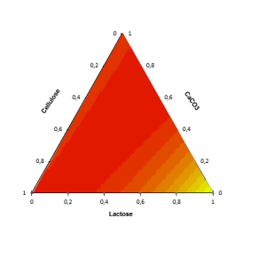
For each combination of factors, we draw a ternary diagram. This graph shows a response surface on one of the faces of the polyhedron to which the experimental space corresponds. These charts facilitate the interpretation of the model and allow to identify the optimal configurations.


analysieren sie ihre daten mit xlstat
Enthalten ind