Pareto-Diagramme
Use this tool to calculate descriptive statistics and display Pareto plots for a set of causes (or qualitative variables). Available in Excel with the XLSTAT software. Available in Excel using the XLSTAT software.

What is a Pareto chart
A Pareto chart draws its name from an Italian economist, but J. M. Juran is credited with being the first to apply it to industrial problems.
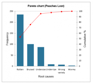
The causes that should be investigated (e. g., nonconforming items) are listed and percentages assigned to each one so that the total is 100 %. The percentages are then used to construct the diagram that is essentially a sorted bar chart and the associated cumulative curve. Pareto analysis uses the ranking causes to determine which of them should be pursued first.
Pareto options in XLSTAT
Several sorting options to be applied to causes are available:
- No sorting: The causes are not sorted.
- Descending: The causes are sorted in descending order according to their frequencies.
- First descending: The causes are sorted in descending order according to the first series of frequencies.
- Alphabetical: The causes are sorted in ascending alphabetical order.
You can also combine some causes :
- Frequency less than: Choose this option to combine categories having a frequency smaller that the user defined value.
- % smaller than: Choose this option to combine categories having a % smaller that the user defined value.
- K smallest categories: Choose this option to combine the kk smallest categories. The value kk is defined by the user.
- Cumulative %: Choose this option to combine all categories, as soon as the cumulative % of the Pareto plot is bigger than the user defined value.
Pareto chart in XLSTAT
For a sample of N causes, the following descriptive statistics are displayed:
- Frequency: the number N of data in the selected sample.
- Relative frequency (%) : the frequency of each of the categories.
- Cumulative % : the cumulative % for each of the categories.
The frequencies or relative frequencies (%) of the different categories of qualitative variables are displayed as bar charts.
You can configure the options of your chart:
Values used: Choose the type of data to be displayed on the left ordinates axis:
- Frequencies: Choose this option to make the scale of the plots correspond to the frequencies of the categories.
- Relative frequencies: Choose this option to make the scale of the plots correspond to the relative frequencies of the categories.
Change color at: Activate this option if you want to change the color of the bars when a specific cumulative % is reached.
All series on one chart: If you selected multiples series of causes or multiple frequencies, activate this option to display all series on a single summary chart.


analysieren sie ihre daten mit xlstat
Enthalten ind