How to Create and Validate Multiple and Simple Linear Regressions in XLSTAT
If you’re like most researchers and data analysts, you probably find yourself in situations where you need to predict future trends, identify key influencers on an outcome, or simply comprehend the connection between variables. In these cases, linear regression is a fundamental tool for anyone trying to understand relationships within their data and make predictions based on those insights. However, getting started with linear regression can be daunting, especially for those new to statistical analysis.
This is where user-friendly statistical analysis tools like XLSTAT and comprehensive training become essential, bridging the gap between the need for advanced statistical methods and the ease of implementing them effectively.
In one of our how-to webinars, Jean-Paul Maalouf, Data Science Consultant, walked attendees through the why and how of using a linear regression model – while also demonstrating how XLSTAT can help check for common errors in this type of modeling.
Watch the webinar or continue reading to learn how to create and validate multiple and simple linear regressions in XLSTAT with Dr. Maalouf.
About XLSTAT Statistical Software
As we’ll be discussing how to use XLSTAT for your linear regression modeling, it can be helpful to become familiar with the overall functionality of this powerful statistical software. XLSTAT can help supercharge and streamline your statistical analysis, all while operating within Microsoft Excel. XLSTAT puts 300+ functions for analyzing, modeling, and visualizing data at your fingertips, and these functions fall into different categories of tools:
- Descriptive – Explaining single variables or links between two variables (e.g., finding the mean or standard deviation in a data set)
- Exploratory – Looking for patterns in large data sets
- Statistical testing – Analyzing data to prove or disprove a hypothesis
- Statistical modeling – Understanding how one variable behaves under the influence of other variables, and then using that relationship, often expressed through a regression equation, to make predictions
- Data preparation – The process of getting raw data ready for analyzing
- Data visualization – Utilizing graphs and charts to represent data information
- Machine learning – Leveraging AI to learn from data and predict outcomes
Additionally, XLSTAT contains advanced features specific to those in the fields of sensory, market research, life science, and quality.
In this article, we’ll focus on statistical testing and statistical modeling. To learn more about these other functions of XLSTAT, check out our tutorials.
What Are Statistical Modeling and Statistical Testing?
To start at the beginning, a statistical model is a simplified representation of reality using data, often involving regression analysis to establish linear relationships. With statistical modeling, we can understand how a variable behaves when other variables change. Once we have a statistical model that has been verified as accurate and useful, we can use it to make predictions about outcomes using new data.
Statistical testing is the process of using statistical models to prove or disprove a hypothesis. In the most general terms, statistical testing is trying to determine whether variable A changes significantly when affected by variable B. This leads to two possible outcomes:
- The null hypothesis: There is no significant change of variable A related to variable B.
- Alternate hypothesis: There is a significant change of variable A related to variable B.
Statistical tests result in a number called the probability value, or p-value. The p-value expresses how likely it is that the null hypothesis is true — that is, how likely it is that there is no significant change. A p-value is a number between 0 and 1 — the closer the value is to 1, the less significant the result is. Every statistical test requires researchers to set their own p-value threshold.
How Do I Choose a Statistical Modeling Method for My Data?
There are many, many different types of statistical models. The method you choose will depend on the data you have and what you want to understand about it. Dr. Maalouf explained some of the common modeling methods for different types of variables.
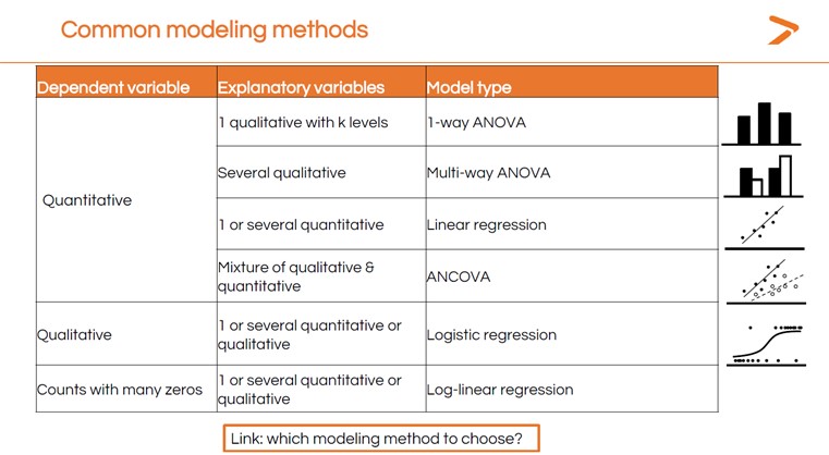
With so many options, it might feel challenging to choose the correct statistical test for your analysis. That’s where XLSTAT’s MyAssistant tool can help. Simply answer a sequence of questions, and MyAssistant will direct you to the right test for your data analysis. We also offer a short statistical modeling guide that can help you choose which modeling method to use in XLSTAT based on your data and the goal of your analysis.
How Do I Determine Which Variables Are Dependent or Independent?
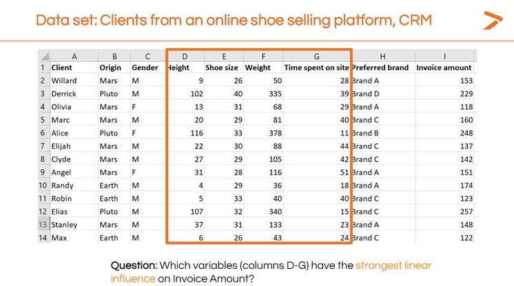
First, frame the question you are trying to answer in words. In the XLSTAT webinar, Dr. Maalouf created a sample dataset meant to represent customer record management (CRM) software from an online shoe retailer. The question he wanted to investigate was: “How does the invoice amount vary according to time spent on site?”
In this example, the variable you are trying to understand (the invoice amount) is the dependent variable. The variable you’re comparing it against (time on site) is the independent variable.
Getting Started with Linear Regression Modeling: Initial Visualization
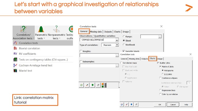
The first step in completing a linear regression with XLSTAT is to get a quick snapshot of how your dependent and independent variables relate using a simple visualization. Dr. Maalouf recommends creating a scatter plot for this initial step.
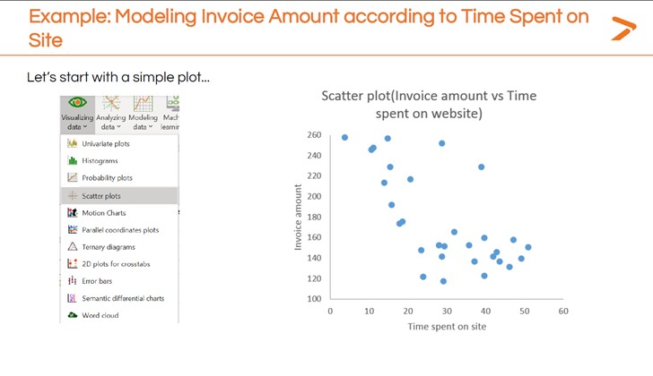
To quickly generate a scatter plot within XLSTAT:
- Click the “Visualizing Data” icon in the toolbar
- Choose “Scatter plots” from the dropdown menu
- In the dialogue box that appears, define which variables you want as your dependent (y-axis) and independent (x-axis) variables
- Generate the scatter plot
The initial scatter plot in the image above seems to show that spending more time on the site correlates to a lower invoice value. Further modeling can give a more precise description of this relationship. That’s where a linear regression comes in.
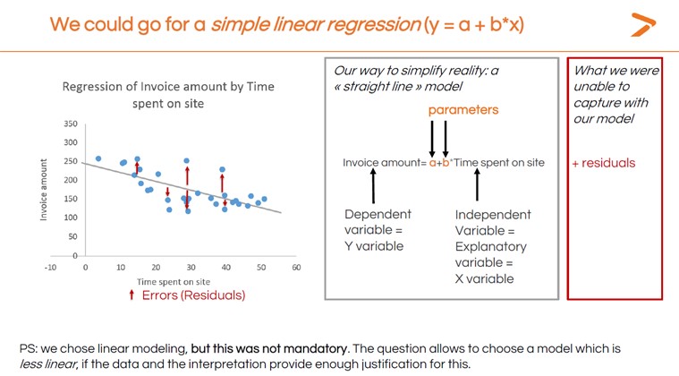
Single-Variable Linear Regression?
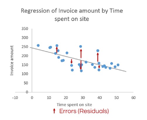
A linear regression is a statistical technique that plots the relationship between two variables as a straight line using a linear model. When interpreting regression, if the line rises from left to right, it is a positive result (that is, as your independent variable rises, so does your dependent variable). If the line falls from left to right, it is a negative result (the dependent variable falls as the independent variable rises). A line that is more or less flat means there is very little change.
The image below shows the basic linear regression calculated for the invoice amount vs. time spent on site example. Not all the data points fall on the line that resulted. Those data points are called residuals and will be discussed later in this article. The parameters in the image can also be referred to as regression coefficients.
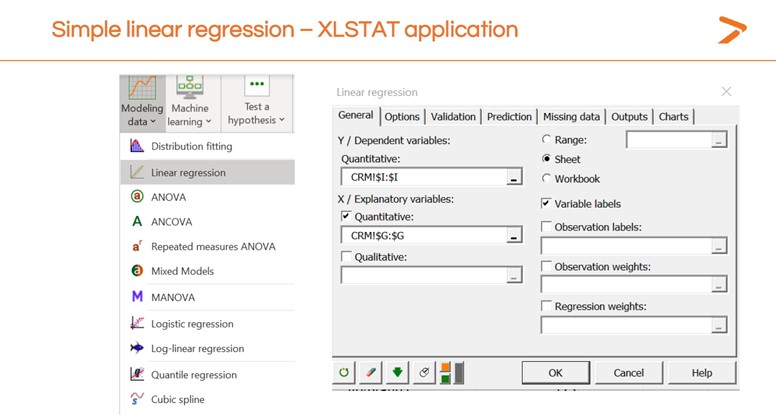
For now, here’s how to generate a simple linear regression model within XLSTAT.
- Click the Modeling Data icon on the toolbar
- Choose “linear regression” from the dropdown menu
- On the “general” tab of the dialogue box that appears, choose the column in your data sheet that represents the dependent variable for the “Y/Dependent variables” field
- Choose the column in your data sheet that represents the independent variable for the “X/Independent variables” field
- Click “OK”
XLSTAT will create a new sheet with the results of your linear regression both as a chart visualization and as a data readout. Now that you have a result, it’s time to interpret it and decide whether your model is useful.
Interpreting Your Result: Model Parameters Table
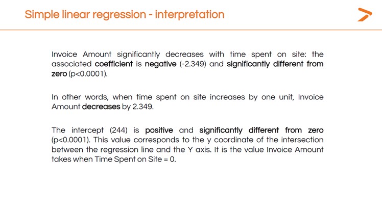
The first output to look at when you’ve created a linear regression in XLSTAT is the Model Parameters table. This shows the p-value (which is very low, suggesting that time spent on site does impact invoice amounts) and other important data.
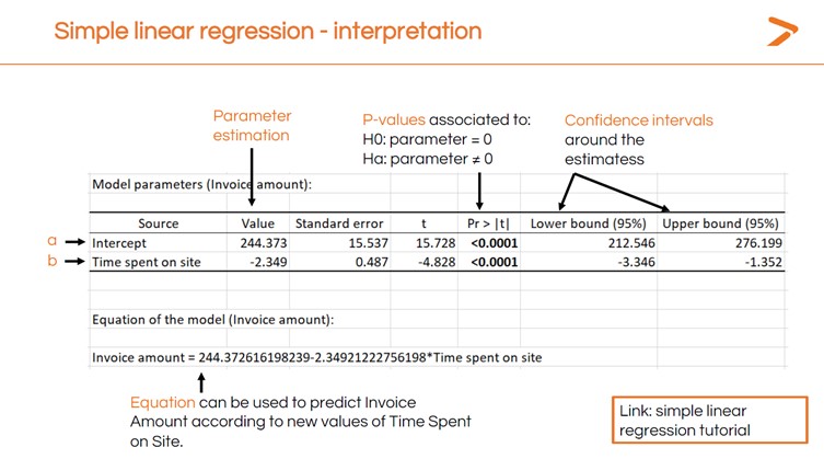
The “intercept” value is the place on the x-axis where the linear regression line begins. This is the mean value of an invoice in the data set. The negative number in the “time spent on site” value shows that the regression line will slope downward at a specific rate.
Now, if you know how long a customer spends on your site, you can predict the invoice value using the following equation:
244.37 – (2.349 x Time on Site) = Invoice Value
So, if someone spends 25 minutes on the site, you can calculate the invoice value this way:
244.37 – (2.349 x 25) = 185.65 Invoice Value
You now have a specific understanding of the relationship between time spent on site and invoice amounts that you can use to predict outcomes (and optimize your website to help people find what they want to buy faster).
The next question is: what about all those residuals? Do they indicate that our model is faulty in some way? XLSTAT can help you validate your model by investigating residuals.
Verifying Your Model: Assumptions About Residuals
Determining the validity of a linear regression involves looking more closely at the residuals. There are four main assumptions we can make about residuals when a statistical model is valid.
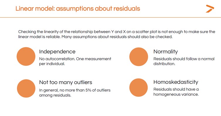
We can check each of these by asking the following questions:
- Are the residuals independent, with one measurement per individual?
- Do the residuals follow a normal bell-shaped distribution?
- Are less than 5% of residuals outliers – that is, very far off the line in either direction?
- Does the variance of the residuals stay about the same all along the line (homoskedasticity)?
We can also check each of these assumptions using XLSTAT. You can get a quick graphical diagnosis of your residuals from the Std. Residuals vs. Predictions chart that is generated when you run your linear regression.
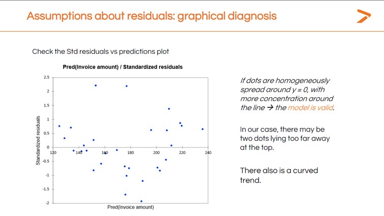
Ideally, the residuals would be clustered around the central line in this chart. Instead, we have a curved trend with several dots very far from the line.
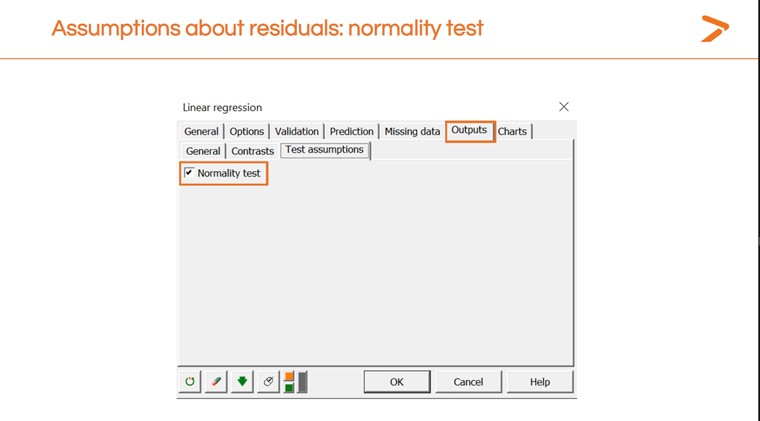
We can also run a “Normality” check from within the Linear Regressions dialogue box in XLSTAT.
This will generate another results table with a p-value. A lower p-value means the model is a good fit; a higher one means it isn’t. The results here indicate the model isn’t a good fit.
Dr. Maalouf pointed out that normality tests work best with larger data sets. Small data sets won’t return reliable results. To understand why, think of each data point like a pixel on a computer screen. If you only have a few dozen pixels, you won’t be able to tell what you are looking at. If you have thousands of them, you see a more detailed image.
Here are two more normality test results that illustrate common patterns of violation – that is, data patterns in residuals which indicate that a different model may be needed.
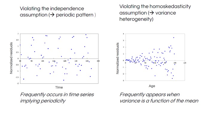
In the left-hand residuals plot, we see a regular “wave” shape in the data. This is common when measuring data in a time series, such as weather data – temperatures predictably vary depending on the time of year, so are not independent. The right-hand plot shows a funnel shape, indicating that the distance between residuals and the line (the variance) isn’t constant.
XLSTAT can help you quickly validate your model with tools to investigate your residuals. If you see issues with your residuals, you’ll have to decide what to do about them.
Look at outliers. If there are reasons they should not be in the data set at all, you could eliminate them.
- If your residuals show a clear non-linear relationship (like the curve in our shoe store data), consider a different model type.
- Decide whether you could transform your y-axis data using log, square root, or Box-Cox transformations (all of these transformations are available in XLSTAT).
Running and Checking Multiple Linear Regressions in XLSTAT
If you want to investigate how several independent variables influence your dependent variable, you can also do that quickly in XLSTAT by running a multiple linear regression (MLR). When setting up your MLR, make sure you don’t choose too many variables and data points. The model that you produce is likely to be “over-fitted” – that is, a very close and accurate description of your data set, but only your data set. You won’t be able to use an over-fitted model to make predictions with new data.
Let’s look at our online shoe store data again. Which of these variables have the strongest impact on invoice amount?
We’ll follow the same steps we followed for the simple linear regression. First, let’s do a quick visualization.
Since we have multiple variables, XLSTAT will generate multiple visualizations for us to examine the linear relationships and correlations. In the matrix below, we see each variable compared to each other variable. There are some striking patterns.
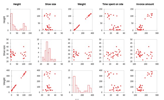
Notice the strong line-shaped scatter plots in the weight and height rows. This indicates that these variables basically show the same data (e.g., the size of a person). We call data points that measure the same factor multicollinear variables. You can eliminate one or the other of them from your model. If you don’t, then your model coefficients will not be stable and the tests will not be good. This is called a multicollinearity problem.
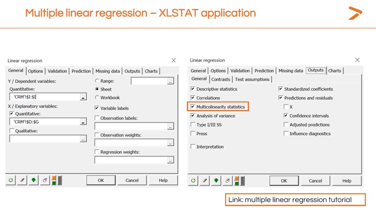
You can also generate a multicollinearity check when running the multiple linear regression in XLSTAT by clicking the “Outputs” tab and checking the “Multicollinearity statistics” box.
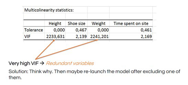
The multicollinearity statistics include a variance inflation factor (VIF) to determine how redundant any explanatory variable is compared to others. A high number is an indication that you should remove the redundant variable and re-launch your MLR.

See how the VIF numbers drop after removing height from the MLR:
After you’ve run your MLR, you will want to check the residuals the way you did for the simple linear regression. In this case, having more variables shows us different patterns in the residuals that could point to other statistical modeling techniques we could try.
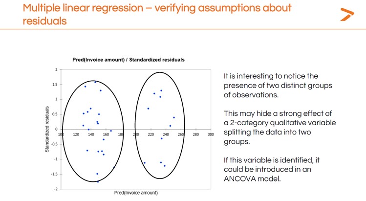
You’ll also want to interpret the results of the MLR to answer your question: which variable has the strongest impact on invoice amount?
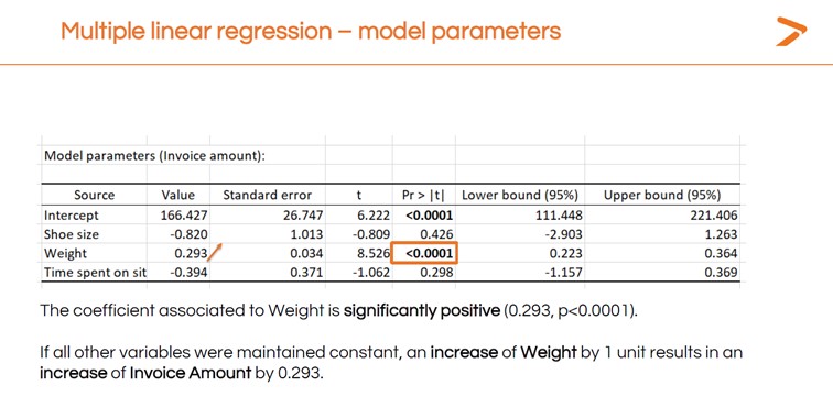
These linear regression analysis results suggest that weight is the only variable with a strong, significant positive impact on the invoice amount since this is the only variable with a significant test.
Learn More About Multiple and Simple Linear Regression with XLSTAT
Interested in learning more about the powerful statistical modeling tools like regression analysis that XLSTAT brings to your Microsoft Excel workspace? Request a free demo today. You can also visit the XLSTAT YouTube channel for more tutorial videos.
Latest tweets
No tweet to display