Back-to-Back histograms and Tornado diagrams
Use this tool to create a tornado chart or a back-to-back histogram from a sample of continuous or discrete quantitative data.
What are Back-to-Back histograms and Tornado diagrams?
The histogram is one of the most frequently used visualization tools as it gives a very quick idea of the distribution of a sample of continuous or discrete data. The back-to-back histogram allows you to compare two distributions quickly.
The tornado chart is a visualization tool similar to a bar chart that allows you to compare the relative importance of two variables. Categories are generally ordered so that the largest bar appears at the top of the graph, the second largest at the second, and so on. In the end, the graphic looks like a tornado, hence its name.
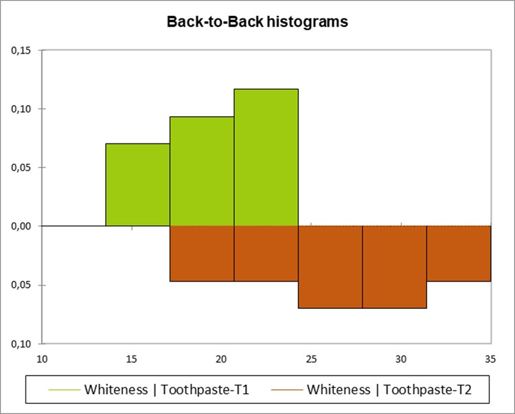
Back-to-Back histograms and Tornado diagrams outputs in XLSTAT
Summary statistics: This table displays the selected samples, the number of observations, the number of missing values, the number of non- missing values, the mean, and the standard deviation.
Back-to-back histograms or Tornado diagrams: The requested graphs are displayed. If you wish, you can change line color, scales, and titles as with any Excel chart.
Descriptive statistics for the intervals: This table displays for each interval its lower bound, upper bound, the frequency (number of values of the sample within the interval), the relative frequency (the number of values divided by the total number of values in the sample), and the density (the ratio of the frequency to the size of the interval).

