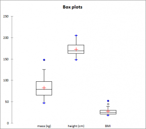
Descriptive statistics (including Box plots and scattergrams)
Compute basic descriptive statistics and draw charts on a large number of variables optionally divided into subsamples with a few clicks in Excel.

Before using advanced analysis methods like, for example, discriminant analysis or multiple regression, you must first of all reveal the data in order to identify trends, locate anomalies or simply have available essential information such as the minimum, maximum or mean of a data sample.
XLSTAT offers you a large number of descriptive statistics and charts which give you a useful and relevant preview of your data.
Available descriptive statistics and graphs in XLSTAT
XLSTAT provides the following statistics:
| Quantitative data | ||
|
|
|
Qualitative data
| Summary for the variables: | Statistics table for each category |
|
|
Also some plots are very helpful to visualize the distribution.
| Charts created for quantitative variables | Charts created for categorical variables |
|
|
Options for box plots, scattergrams and strip plots
Group plots: Check this option to group together the various box plots, scattergrams and strip plots on the same chart to compare them.
It is possible to specify the "Dimension" corresponding to the maximum number of boxplots to group. By default, this number is automatically chosen based on the number of variables and categories. You can also specify it manually. This number can be at most 20 for Excel 2003 and 40 for Excel 2007 and beyond.
Categories: Check this option if you want to group all categories per variable. This option is available when the Subsamples field (general tab) is used.
Variables: Check this option if you want to group all variables per category. This option is is available when the Subsamples field (general tab) is used. Check the Grey line option to separate variables with grey lines on the plots.
Sort by mean: Check this option to sort the variables or categories by decreasing mean.
Notched: Check this option if you want to display notched box plots.
Adapt width: Check this option if you want that the width of the box plots depends on the sample size.
Minimum/Maximum: Check this option to systematically display the points corresponding to the minimum and maximum (box plots).
Outliers: Check this option to display the points corresponding to outliers (box plots) with a hollowed-out circle.
Color inside: Activate this option to color the inside of the box plots.
Color by group: Activate this option so that the color of the box plots varies for each subsample, if subsamples have been selected.
Options for bar charts and pie-charts
Bar charts: represents the frequencies or relative frequencies of the various categories of qualitative variables as bars.
Pie charts: represents the frequencies or relative frequencies of the various categories of qualitative variables as pie charts.
Doughnuts: this option is only checked if a column of sub-samples has been selected. These charts are used to compare the frequencies or relative frequencies of sub-samples with those of the complete sample.
Stacked bars: this option is only checked if a column of sub-samples has been selected. These charts are used to compare the frequencies or relative frequencies of the different groups of the sub-sample.
Multiple bars: this option is only checked if a column of sub-samples has been selected. These charts are used to compare the frequencies or relative frequencies of the different groups of the sub-sample.
Values used: choose the type of data to be displayed:
- Frequencies: choose this option to make the scale of the plots correspond to the frequencies of the categories.
- Relative frequencies: choose this option to make the scale of the plots correspond to the relative frequencies of the categories.


analyze your data with xlstat
Related features