TCATA
Use TCATA method (Temporal-Check-All-That-Apply) to analyze your TCATA data. Available in Excel with the XLSTAT software.

What is TCATA method?
The TCATA method is a temporal extension of the CATA (Check-All-That-Apply) method developed by Castura et al (2015). This method describes the multidimensional sensory properties of products as they evolve over time. Selection and deselection of attributes are tracked continuously over time, allowing assessors to characterize the evolution of sensory changes in products. Graphical results make it possible to visualize the evolution of sensory profiles over time and to compare products. TCATA data must be balanced, meaning that each assessor must evaluate all products in each session.
Options for TCATA in XLSTAT
Two different data formats can be used for TCATA data:
Binary: Data has as many rows as there are product product/assessor/attribute and possibly sessions combinations, and as many columns as there are time points. The data is saved in binary form (1 if the attribute is selected, 0 otherwise).
Start/End time: Two columns are expected. For each row corresponding to a product/assessor/attribute combination and possibly session, the "Start time" column contains the time when the attribute was first checked and the "End time" column contains the time when the attribute was unchecked. If the same attribute is selected again later, then a second line with the same product/assessor/attribute combination is required.
Results for TCATA in XLSTAT
The main results specific to the TCATA method are as follows:
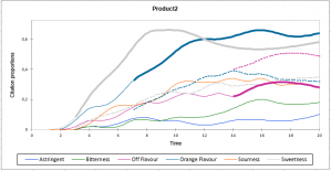
Citation proportions curves: For each product, the citation proportion curves of each attribute are displayed as a function of time. There is an option to smooth the curves. You can also display a reference curve for each attribute. For a given product, this reference curve corresponds to the average proportion of citation for all other products pooled. In order to test the difference between the curve of an attribute and its reference curve a Fisher test or a Khi² test is performed. To avoid overloading the chart, reference curves are displayed only if the difference is significant for a given time. When a significant reference curve is displayed, the corresponding attribute curve is highlighted.
Product Differences between products: A chart is displayed for each product pair. For each attribute we look at whether or not the difference in citation proportions is significant using a Fisher test or Khi² test. When the difference is significant for a given time, the difference in proportion curve is displayed.
Product trajectories: A correspondence analysis (CA) is performed in order to define the product trajectories. Each row corresponds to a product/time combination and the columns contain the attributes. The factorial coordinates of the rows (product/time) are linked together and thus the product trajectories over time are displayed on the factorial plan. The end point (maximum time) of each trajectory contains the label with the name of the product.


analyze your data with xlstat
Included in
Related features