Probability plots
Use this tool to visually control if a sample may come from a population that follows a given distribution. Create a probability plot in Excel with the XLSTAT software.

What is a Probability Plot
Probability plots is an old method (Hazen, 1914), that has been extensively used, especially through the use of printed probability paper. It is useful to visually control whether a sample follows a given distribution.
Any XLSTAT distribution can be used (see the Histogram tool for the full list). The fitting of the distribution can be done before creating the plot. The distribution that fits best can be automatically chosen by XLSTAT, or you can select a specific distribution and choose to enter the parameters or let XLSTAT estimate them.
Probability Plot options in XLSTAT
Plotting position: To construct a probability plot, xi is plotted against F-1(pi), where pi is the estimate of F(xi), namely the plotting position. Several approaches have been proposed to compute pi. XLSTAT includes the following options:
- Blom (1958): pi = (i – 0.375)/(n + 0.25)
- Hazen (1914): pi = (I - 0.5)/n
- Weibull (1939): pi = i/(n + 1)
- Filliben (1975): p1= 1-0.5n / pn=0.5 n / pi=(i – 0.3175)/(n + 0.365) (1<i<n)
Parameters: You can choose to enter the parameters for the distribution, or estimate them. If you choose to enter the parameters, you must enter their values.
Estimation method: Choose the method of estimating the parameters of the chosen distribution. Two methods are proposed: the moments method and the maximum likelihood estimation. XLSTAT proposes as well the possibility to compute the estimated order statistics for a given distribution using Monte Carlo simulations.
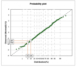
Percentiles: Activate this option and select up to four percentiles that you want to display on the chart.
Probability Plot results in XLSTAT
The table of descriptive statistics shows the simple statistics for all the variables selected. The number of missing values, the number of non-missing values, the mean and the standard deviation (unbiased) are displayed for the quantitative variables. For qualitative variables, including the response variable, the categories with their respective frequencies and percentages are displayed.
If a distribution has been fitted to the data, the results of the fit and the estimated parameters of the distribution are displayed.
The probability plot is then displayed, with, if the corresponding option has been selected in the dialog box, the confidence intervals.


analice sus datos con xlstat
Productos relacionados