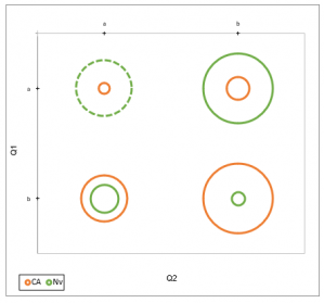
2D plots for cross tables
Use this tool to create a 2-dimensional plot based on a cross table. Available in Excel with the XLSTAT software.

This visualization tool allows to quickly generate a 2D plot showing the relative importance of the various combinations that you can obtain when creating a two-way contingency table (also called cross-tabs). This tool can work directly on raw data (weighted or not) or on a cross table.
2D Plots for cross tables options in XLSTAT
Cross table: Activate this option if your data correspond to a cross table.
Qualitative variables: Activate this option if your data are available as two qualitative variables to be used to create a contingency table.
Z: If the data format is "qualitative variables", check this option to select the values which will weigh the observations and modify the size of the points on the plot. If you want to display several dimensions on the plot, you can select several columns. If you want that the same scale is used for each dimension on the plot, activate the same scale option.
Size: Choose which dimension is related the values (Z): area, width or width^2. With area, the area of the points is proportional to the values, so this is diminishing the difference between small and large values. It is the opposite with width^2.
Scale(%): Choose how the points should be rescaled. The default is 100 and corresponds to no rescaling.
Horizontal axis at bottom: Check this option to display the horizontal axis at the bottom of the chart.

