Univariate plots
Visualizing data prior to any analysis is a fundamental step. Several univariate plots including box plots are available in Excel with the XLSTAT software.

Before using advanced analysis methods you must first of all reveal the data in order to identify trends, locate anomalies or simply have available essential information such as the minimum, maximum or mean of a data sample.
XLSTAT offers you a large number of descriptive statistics and charts which give you a useful and relevant preview of your data.
Although you can select several variables (or samples) at the same time, XLSTAT calculates all the descriptive statistics for each of the samples independently. Several types of charts are available.
Charts for quantitative data
Box plot
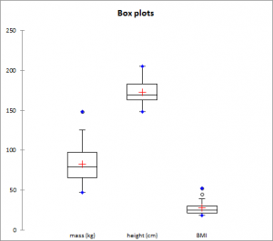
Also called box and whisker diagram. It is a simple and quite complete representation since in the version provided by XLSTAT the minimum, 1st quartile, median, mean and 3rd quartile are displayed together with both the limits (the ends of the whiskers) beyond which values could be considered as anomalous (or outliers).
Scattergram
The scattergram gives an idea of the distribution and possible plurality of the modes of a sample. All points are represented together with the mean and the median.
Strip plot
The strip plot represents the data from the sample as strips. For a given interval, the thicker or more tightly packed the strips, the more data there is.
P-P Chart (Normal distribution)
P-P chart (for Probability-Probability) is used to compare the empirical distribution function of a sample with that of a normal variable for the same mean and deviation. If the sample follows a normal distribution, the data will lie along the first bisector of the plan.
Q-Q Chart (Normal distribution)
Q-Q chart (for Quantile-Quantile) is used to compare the quantities of the sample with that of a normal variable for the same mean and deviation. If the sample follows a normal distribution, the data will lie along the first bisector of the plan.
Charts for qualitative data
Bar chart
It represents the frequencies or relative frequencies of the various categories of qualitative variables as bars.
Pie chart
It represents the frequencies or relative frequencies of the various categories of qualitative variables as pie charts.
Double pie chart, Doughnut, Stacked bars and Multiple bars
Those plots are used to compares the frequencies or relative frequencies of sub-samples with those of the complete sample.

